Google I/O '18 Developer News
Disclaimer: The following content is based on personal recollections and interpretations and may therefore be incomplete or faulty. Attendance was funded by me as a private individual so views and opinions do not reflect those of my employer. Content licensed under Creative Commons (CC BY) Casper Bang.
A few days ago I wrote about the Google I/O 2018 keynote which is not particular technical and is primarily addressing the general tech public (managers, journalists and the like). Most of I/O revolves around much deeper content of course, split between technical talks, office hours, sandboxes, expositions etc. and below I will try to summarize on this - if you are NOT a developer, this may not be for you.
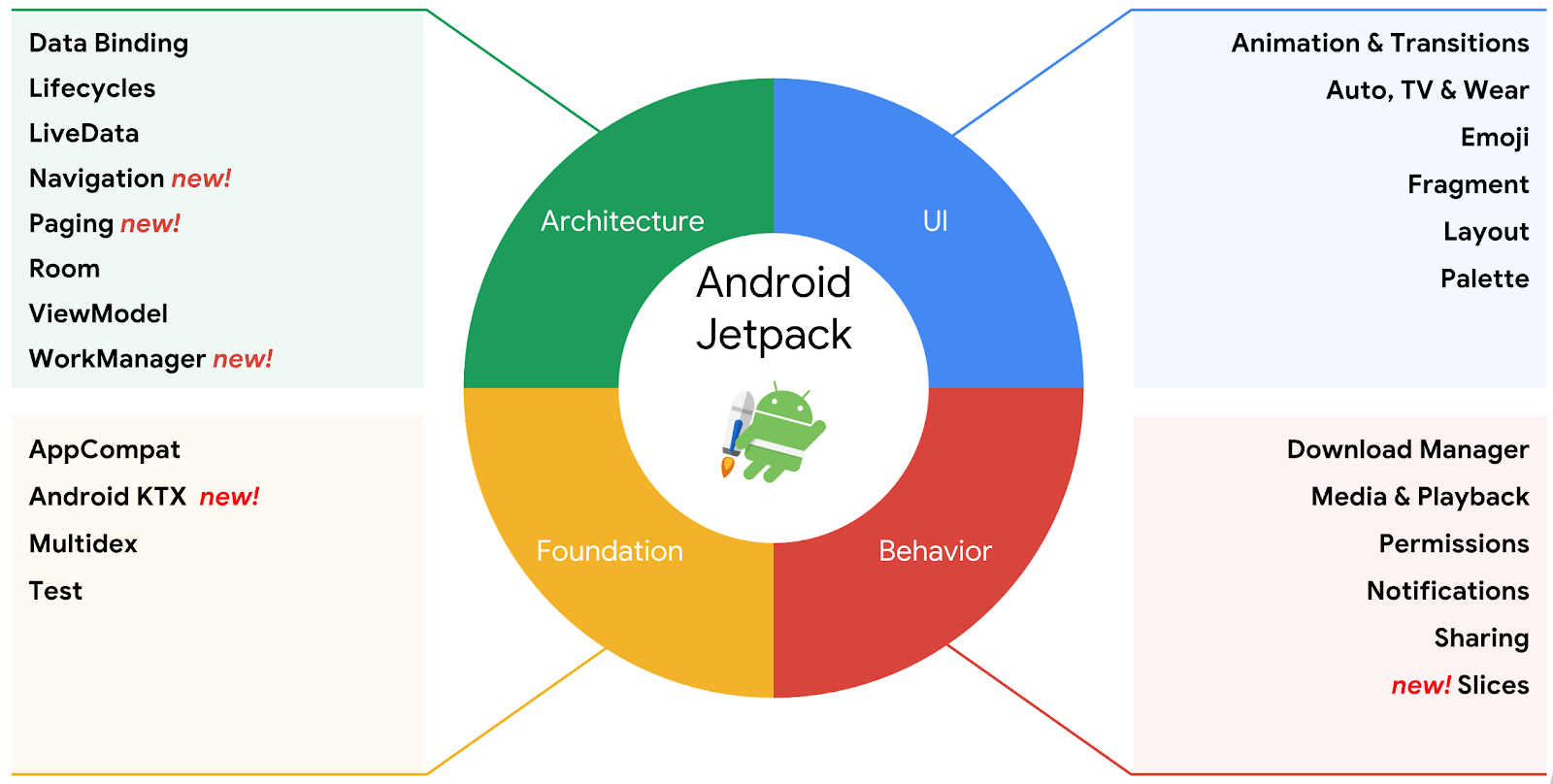
Android JetPack
This was a brand new term being presented to us at the Developer Keynote on day one, as there weren't even hints of this in the Google I/O app nor on the schedule. While initially somewhat confusing, after having spent 3 days with sessions and talking to Google employees, it is now more clear to me. Android JetPack is an overall umbrella covering libraries, tools and architectural guidance to help building best-practice Android apps. It addresses the following aspects.Support-library rebranding and refactoring
The Support library is an essential part of most Android projects, but its organization and versioning is somewhat complex. Google is now splitting the support library up in smaller discrete parts and under the new packagename androidx.* rather than android.*, to make it clear what's bundled with the Android OS and what's bundled with the app. Apart from the change in package name and more fine grained structure, the library versions have been reset from 28.0.0 to 1.0.0. This is a welcomed cleanup and it seems like the tooling in the latest Android Studio 3.2 Canary build 14 is already offering great support for this migration.Android Architecture Components
Google never had opinions on the actual architecture and structure of an application (you probably know this rather famous response by Dianne Hackborn about the subject), which is great for freedom but not so great for consistency across apps or figuring out best-practice. At last years Google I/O the Android Architecture Components launched to address some of these issues, incl. reactive programming between View and ViewModels for a somewhat MVVM looking architecture. This year Google takes this a step further, under the JetPack umbrella.
Navigation and backstack management
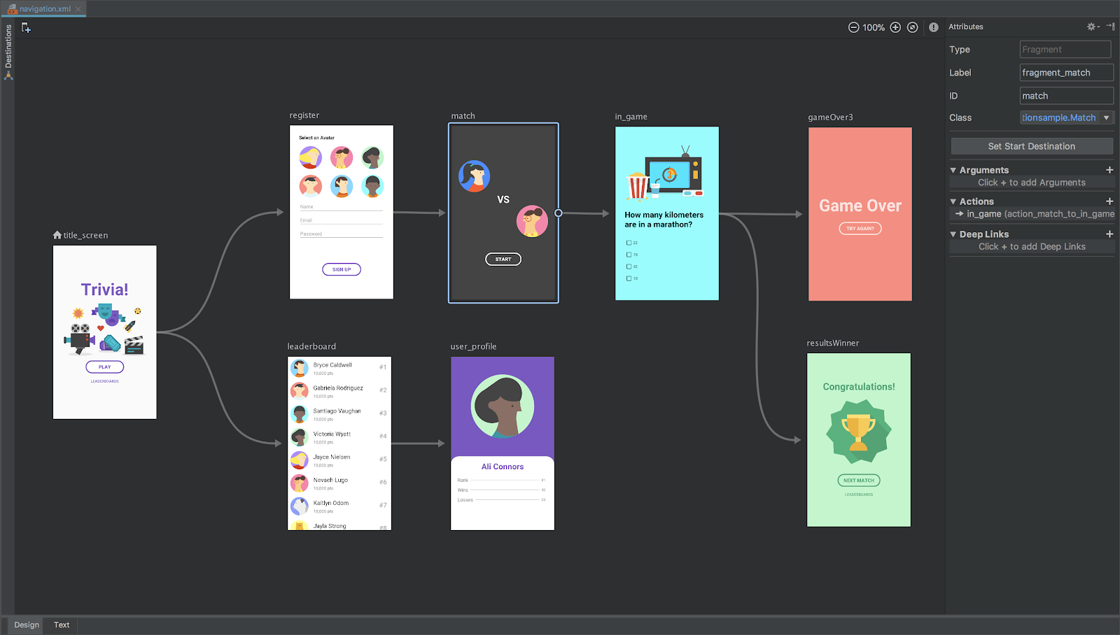
One of the major issues on Android remains flow and navigation within the app, since you are forced to think hard about the wiring and transitions between Activities and Fragments - done exclusively by code and without any overview or insight into these navigation flows afterwards. A closely associated nuisance is dealing with the backstack which is also often quite a headache - especially if you have UX designers focusing on iOS, who tends to forget that on Android, by default, you can always go back to a previous screen (be it Fragment or Activity).With JetPack, Google is now bringing navigation front and center, by getting rid of the need of doing manual transitions in code altogether. This is achieved by adding support for a Navigation Component in the libraries and Android Studio as well as advocating for a single-Activity architecture.
This latter point is a clear departure from earlier recommendations, and now it's recommended to only use several activities if you have very specific deep-linking needs and point-of-entry control.
You can read up on this new navigation component here. It's in alpha so while early days, it seems a good idea to adopt this for new apps - you are not likely to be able to retrofit an existing app particular easily. As a practicing Android developer this is one of the most noteworthy announcements at this years Google I/O, simply because it's likely to have a profound implication on the development and maintenance of apps in the future.
WorkManager
We've had AlarmManager for scheduling work on Android since day one. This was replaced in Lollipop by JobScheduler which added a much more powerful abstraction, catering to more aspects than just time. To confuse the matter further, we also got to mess around with SyncAdapters, Firebase JobDispatcher etc.Now we're getting a replacement for it all in the way of WorkManager, which does not require Google Services to be installed on the device and which offers an even richer API than JobScheduler, based on constraints you specify for when and how you want the work done. WorkManager gains features making it support other Architecture Components constructs, namely LiveData. JobScheduler is very robust and not likely to go anywhere soon, but it's hard to see a reason not to use WorkManager on all future Android work. Like much of JetPack, WorkManager is also an alpha release.
Paging
Whenever you need to load and show lists of just about anything on Android, you're best of using the RecyclerView - a versatile and efficient component introduced with Lollipop. With the increased popularity of reactive programming (internal LiveData and external RxJava) and the introduction of the Room ORM in Android Architecture Components last year, we're now getting a Paging library, to address the paging aspect both in terms of performance and (network) error handling. This is a welcomed addition to Architecture Components, because developers were often stuck trying to figuring out the glue between view, local database and remote resource - and optimal synchronization between these. Interestingly enough, the Paging library is not an alpha release but already marked as stable.App Bundles & Dynamic Delivery
Over the years app's have increased in size and complexity. While not quite as bad on Android as on iOS, larger download sizes means more users sticking to older versions, sub-optimal user experience as well as increased data-usage.Google have always used the so-called "split" mechanism, to split APK's on dimensions such as density (DPI), architecture (ABI's) etc. automatically or as instructed by you. The best example of this is probably the fact that there are a whopping 31 variants of the Google Support Library version 12.6.85 - should you choose to go after the raw APK rather than having your device or Android Studio handle this for you. The main reason for this is of course to ensure that the user only gets the stuff he actually needs - since there's no reason to include very high density graphics for a low-grade phone unable to render this anyway.
Well now Google is taking this to the next level, by introducing an improvement to this split mechanism, known as App Bundles which makes use of Dynamic Feature Modules. What this means is that you will be able to modularize your app into key features catering to casual users who just needs basic functionality as well as hardcore users taking advantage of every corner of your app. Facebook and its Messenger comes to mind here, but really this mechanism seems to be applicable to solid design principles for just about any app and as a fan of microarchitecture/plugin designs this sounds pretty awesome.
The Dynamic Feature mechanism works on Android L (Android 5.0/API level 21) and later - for older, you decide whether to bundle the feature in or not. While not quite ready yet, Google says it's their intention to make Instant App's and Dynamic Feature Modules work hand in hand - so in the future perhaps we may not be installing an app at all, but simply follow a link with basic bootstrapping functionality using Instant App where the rest is added on-demand using Dynamic Feature Modules!
Slices
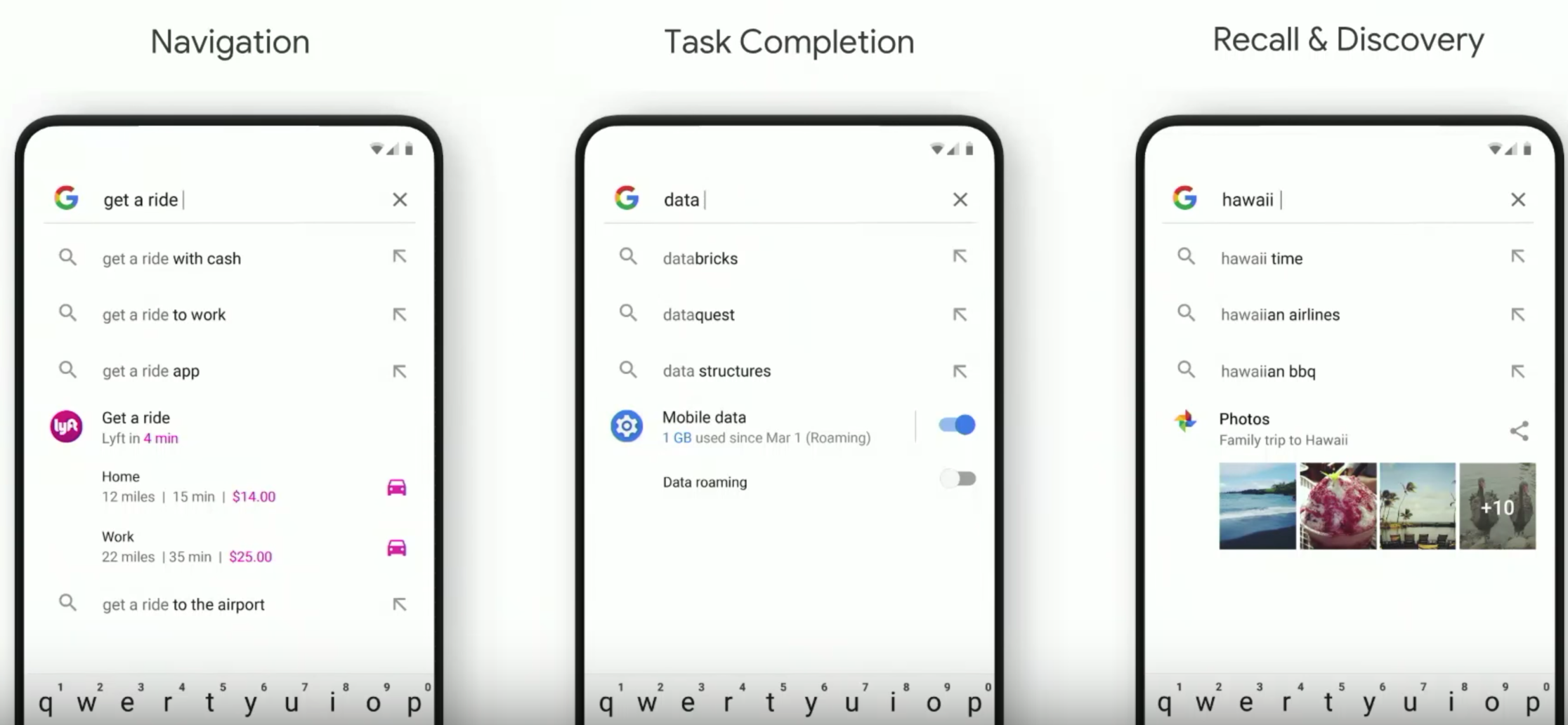
At first sight, this smells a bit of Instant Apps and App Actions but it adresses an entirely new problem. This is an interesting response to the problem of people installing your app, but never using it again because they forget its there or don't know about its features.Imagine if you could provide small parts of your app to people making searches using the Google Launcher, a Google search or the Google Assistant, without them actually having to launch your app directly at all. That's the very interesting promise of Slices! A "slice" is a way to surface your app's UI inside another app - or as one Google engineer explained it, Google's new approach to remote content. To understand this, it's probably easier with a few examples.
The first example "Navigation", shows how Lyft (a service like Uber but with better ethics) is able to promote itself as a provider of a lift home or to work, with a car arriving in 4 minutes while showing the price - all from just from having typed in "get a ride" as a search term! The second example shows "Task Completion", how the Android OS itself (starting from P) is indexed in order to integrate with Google search. The last example shows "Recall & Discovery", where content within your apps can be indexed and found.
I didn't really see this coming, but it's interesting at least on one front; it's going to provide a uniform interface for uniting similar but competitive services! After all, it's not hard to image, in a few years, we won't even launch an app directly anymore - we'll just express our intent, choose a provider (based on some very rich criteria) and only then decide who we should ride with (Taxi, Bus, Train, Waze, Uber, Lyft etc.). Want to listen to a particular song or watch a special movie? Just search for it and let the aggregating providers fight among themselves to bring you a hit; gone will be the days where you need to consult multiple apps manually one by one.
Slices is in alpha, expected to reach stable by the launch of Android P and backportet to older versions as well.
Kotlin Extensions
Google remains committed to Kotlin, evident not only by the fact that most talks with slides used Kotlin rather than Java, but also because they keep adding features for making the development experience superior. The Kotlin Extensions which we already know and lovefor i.e. its view binding mechanism, is getting a boost by some new extensions, most noticeably some to support working with the new Navigation features I mentioned earlier. These appear to follow the same fine-grained break-down model as the Support Library refactoring, where you can pick and choose what you need. These extensions are all in an alpha release.D8
D8 is the new code desugaring tool (removal of syntactical sugar from the compiler frontend). Previous to Android Studio 3.2 it had to be enabled specifically by setting a flag:android.enableD8=true
Since Android Studio 3.2 it is now enabled by default, yielding better performance.
R8
The minification tool ProGuard has served us well for many years, but now Google is taking matters into their own hands by introducing R8 (Reducer for Java 8?). It probably has to do with the latest D8 desugaring-tool and the fact that, in order to obtain better build speeds and smaller APK/AAR sizes, ProGuard is no longer working on the right abstraction layer. Thankfully, the R8 tool is fully compatible with the ProGuard DSL rule language so there should be no changes from a user point of view. Google made R8 open source so there's also no real licensing differences except swapping out GPL2 for a BSD-style license. Unlike D8, R8 is not enabled by default in Android Studio 3.2 so you have to explicitly turn this on by setting the following flag:android.enableR8=true
Interestingly to me as a dane, R8 appears to be at least partially developed by Google Denmark judging by the active committers Mads Ager, Søren Gjesse and Christoffer Adamsen.
ConstraintLayout
If you're a seasoned Java developer remembering Swing, you will now have seen two races of "layout manager done right". In Swing we eventually ended up with GroupLayout and IDE support in the form of Matisse. On Android, we seem to now have ended up with ConstraintLayout - a truly one-size-fits-all solution, which allows flexibility, avoids deeply nested layouts (this slow) while still being possible to grasp.Version 1.1 was just released, but at Google I/O we got to see version 2.0. This version adds more attributes for populating the layout-editor a design time with representative data. More interestingly, there is now also support for animation using decorators, supported by a motion design tool within the IDE - which is sure to make adding custom animation work much simpler and faster.
ConstraintLayout 2.0 is not released yet, but is said to be released soon - it's unclear in which state (alpha, beta or final). What is abundantly clear however, is that one better get up to speed on ConstraintLayout as the default go-to layout manager for Android development.
ML Kit for Firebase
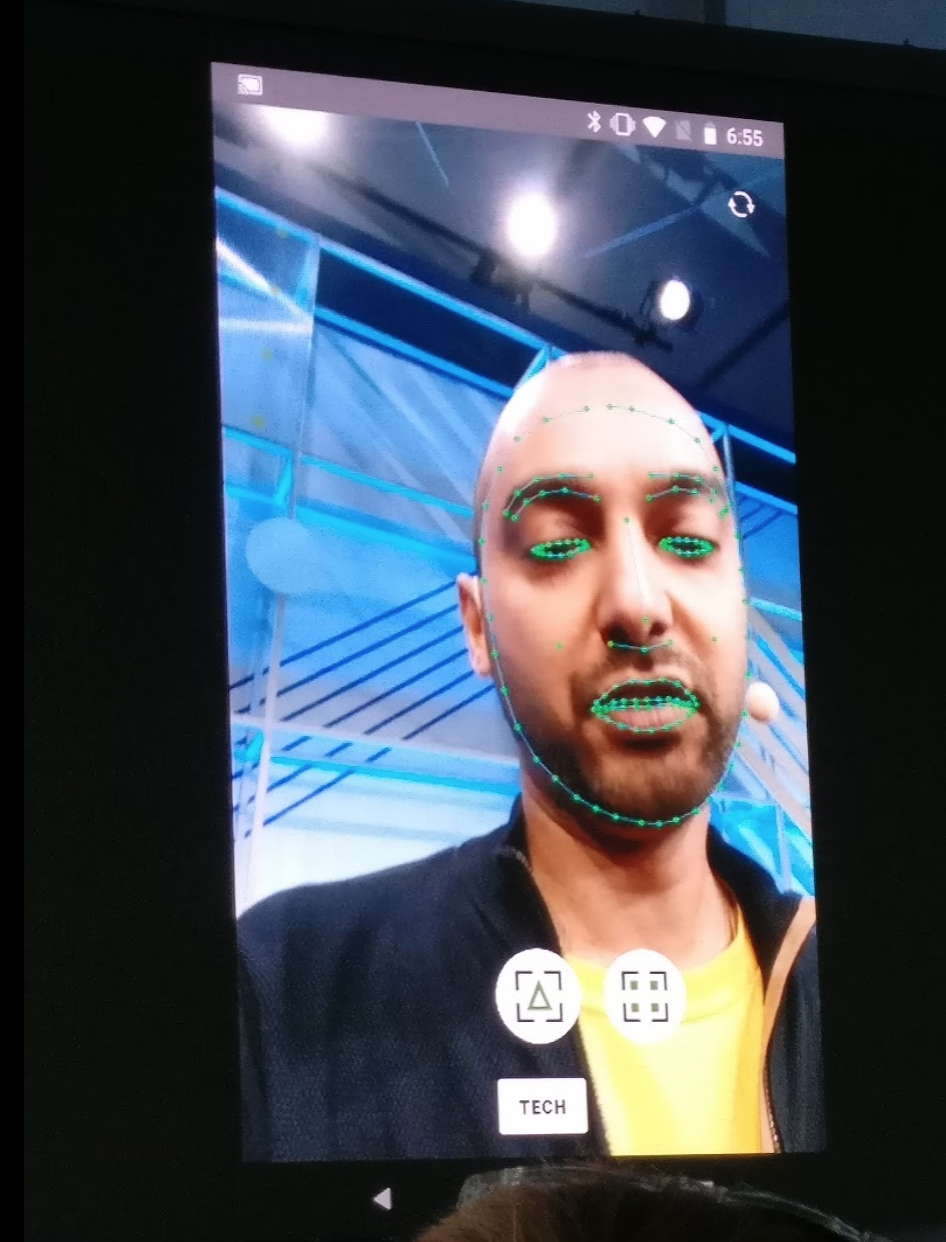
So this one is not Android related - not directly anyway, since it applies to cloud and iOS as well. As someone who spent time doing Machine Learning with TensorFlow Lite, I can attest to the need of making Machine Learning tools more approachable - alas, Google is now adding such an abstraction on top of Firebase!The on-device API is free to use while the cloud-based service API follow the common Firebase cloud API pricing.
ML Kit for Firebase is currently a beta feature already visible in your Firebase Console and you can read more about it here.
Firebase TestLab for iOS
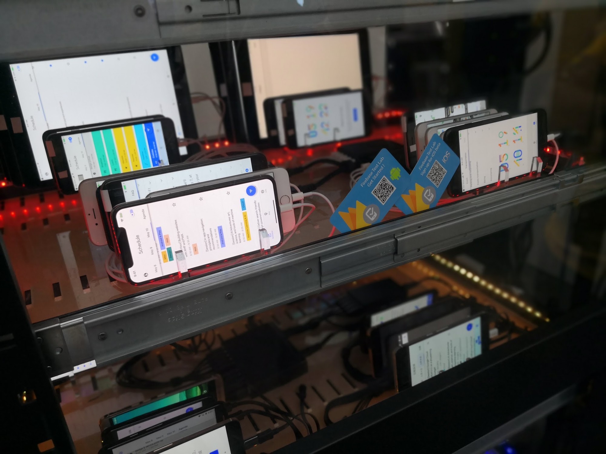
Staying with the Firebase theme a bit, TestLab now gained support for testing iOS apps! This is a huge step for Firebase to be taken seriously as an overarching support stack for mobile development, covering more then just Android.While for Android we continue using UiAutomator and Espresso tests, you need to use XCTest for iOS apps. The Free plan provides a daily quota of 5 physical and 10 virtual device test executions. The Blaze plan (which I use) is pay-as-you go much like BigQuery.
Material Design 2.0
With the upcoming Android P rumoured to be another iteration on Google's Material Design language, causing Google to do a relaunch of their website material.io, I'm going to take the liberty of referring to this as Material Design 2.0.I interpret Material Design 2.0 as relaxing the original Material Design guidelines, which could be seen as quite rigorous and thus not favorable to custom branding/theming. This now seems to be addressed by means of Material Theming. As an example of this relaxation, FAB (Floating Action Bar) buttons are now customizable so that they do not necessarily need to sit in just one place and they also don't necessarily need to be round - i.e. if your brand caters more to a diamond shape.
It's is a welcomed touch; as a native app developer believing the best app comes from developing "to the OS" rather than merely "on the OS", I often struggle with designers trying to fit their iOS design onto Android. What has been known to happen, is that designers will launch YouTube, Google Photos, LinkedIn and other behemoth apps with 100.000.000+ users and use the observed legacy UX idioms of these apps as a baseline - rarely aligned with the latest and greatest of Material Design. Speaking of designers; they are now getting a plugin for Sketch to make their work easier.
While things may improve here for theming and branding, Google is still adhering to their Materal Design Components as a base of usability. These components are actually manifested in 5 separate libraries, since there is support for Android, iOS, Flutter, Web and React. All libraries are open-source and live on a public GitHub site under an Apache 2 license. It's Google's vision that you should not need to build UI using custom components unless you have a really good reason to do so. As a developer favoring component reuse, I'm a big fan of this way of thinking.
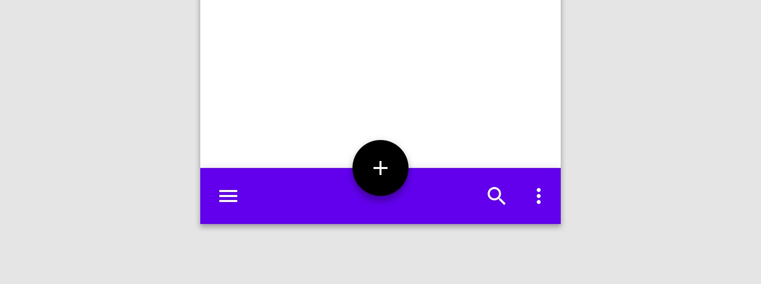
The most noteworthy new component to me is the bottom app bars with a centered Floating Action Button sitting a bit lower, and integrated into a bottom bar.
It's a nice touch, and unlike the Bottom Navigation bar, the Bottom App Bar should be used for task-based flows rather than app-wide content navigation. The retake on Material Design can already be experienced in the Google I/O 2018 app, Google Pay, Google Tasks and Gmail - but other teams inside Google are said to be updating their design accordingly soon.
Wrap Up
All in all, there's much to be excited about here - arguably more so than was hintet at the Keynote. As an Android developer, JetPack - Android Architecture Components - Navigation support stands out. Google have been listening to developers struggling with finding a best-practice app architecture and are now finally responding to this need. Hurray!App Bundles and the Dynamic Feature Modules have the potential to shake things up quite a bit on the long run - along with Slices. It's hard to predict the intersection of these technologies but it's clear that Google is taking a "lets throw stuff up on the wall and see what sticks" approach, leaving nothing unexplored. It strikes me that it's fairly important to keep an eye on these features in the coming year as we see them mature and used in practice.
The ML Kit for Firebase also looks really interesting, even if I had promised myself never again to burn 2 days with work that I did not understand nor had reasonable expectations to ever have the time for. ML Kit is sure to lower the bar from native TensorFlow.
For some reason, none of the talks I went to made use of the in-audience placed microphones, so unlike last year, it was more difficult to get to ask the guro's - and the chaotic office hours didn't work out for me this time either. I really think Google needs to address this aspect, if nothing else, add a moderated "Q&A discussion" section to the I/O app so that vague sessions or follow-up questions could be handled better. For me, I would still love to know why so many of Google's own apps appears to violate their own Material Design guidelines by showing 4 icons with label in a bottom navigation component - something requiring custom hacking to achieve. Google+, Google Photos, YouTube, Google News are all some pretty major app examples of this - which makes it hard to convince designers, who will look at Google's apps before reading technical guidelines.
UPDATE: It seems that Google have updated the Bottom Navigation component and associated design guidelines to now support a more flexible policy. This is possible if you use version "28.0.0-alpha1" of the support library along with "android-P" as compileSdkVersion.
Google is really snappy at getting conference coverage out on YouTube, so you can already watch the 192 technical talks there - if you can convince your boss to spend time on it. Also remember, you can play around with many of the new features highlighted above, by going to Google's CodeLab pages which is definitely path-of-least-resistance for learning this new stuff. I certainly plan to do this as soon as I get rid og jetlag and have caught up with my day job. :)
Google I/O is truly a festival for geeks - simply unmatched by any other conference!




Comments